SELECTED PROJECT / QB STUDIO
NXSTEP Capital Holdings.
A confident corporate identity built around a clear, geometric symbol and an adaptable visual language.
BEHIND THE DESIGN
Built with
intention.
The identity at a glance
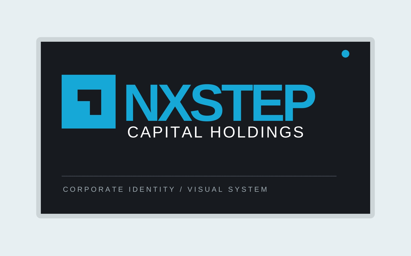
NXSTEP Capital Holdings uses a direct, geometric visual language. The square icon carries a stepped negative-space corner, giving the mark a compact silhouette that can be recognized apart from the wordmark. A bright cyan-blue treatment provides contrast against white, charcoal and darker settings.
Design system
The typography is intentionally clean and strong, paired with a smaller CAPITAL HOLDINGS descriptor. The supplied identity presentation includes clear-space and measurement guidance, helping maintain consistent proportions in use. Several color treatments show how the system adapts while preserving the shape of the primary mark.
Where it comes to life
Project applications explore exterior business signage, the standalone symbol and a coordinated stationery family with business cards, correspondence and branded surfaces. Together, they show how a minimal corporate mark can remain coherent across print and environmental uses.
- Geometric symbol and corporate wordmark
- Color variants and clear-space guidance
- Business cards and stationery mockups
- Exterior signage and brand applications

YOUR NEXT BIG IDEA STARTS HERE
HAVE A PROJECT
IN MIND?
Let's make something extraordinary together.
Let's talk design ↗